Problem: aria-labels are often implemented poorly
Problem: aria-labels are often implemented poorly.
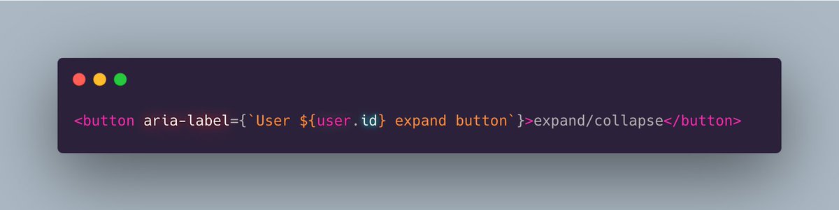
Here are 4 aria-label mistakes in one snippet:
This reads as "User 1 expand button". 👎
Issues:
1. "button" is redundant. Don't repeat the name of the element in the aria-label.
2. The label should specify if the click will expand or collapse, based on the current state.
3. Use a user-friendly identifier. Avoid ids. Instead, the user name is likely best here.
4. A button *does* something. So start with a verb, and specify what happens when the button is clicked.
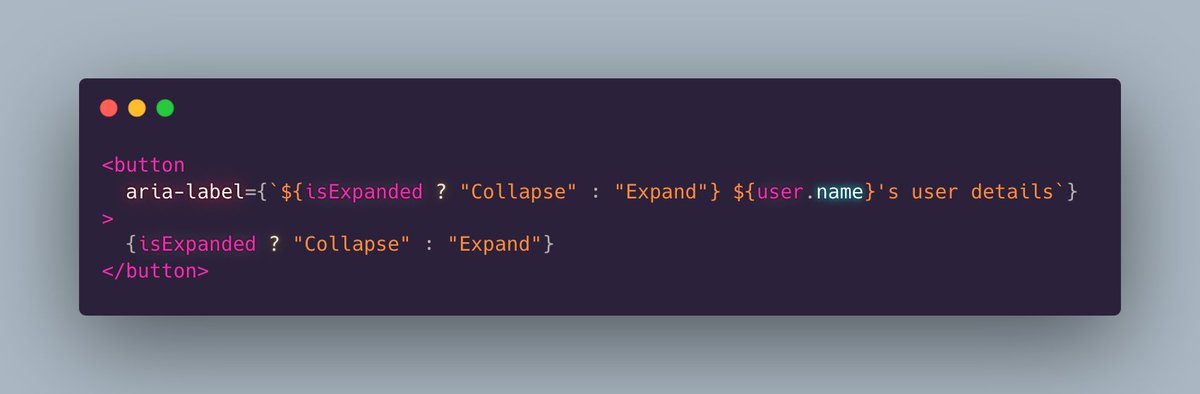
Solution:
Now the button's accessible label reads clearly. For example "Expand Bob's user details". 👍
Oh, and don't forget the first rule of aria:
Aria is a last resort.
For example, if you can label the button in a descriptive way visually, that's often preferable because then all users benefit.
In this case, labeling each button like "Expand x's user details" visually would likely be redundant and noisy. So the aria-label allows us to implement a "clean" visual design, and still provide an accessible experience.
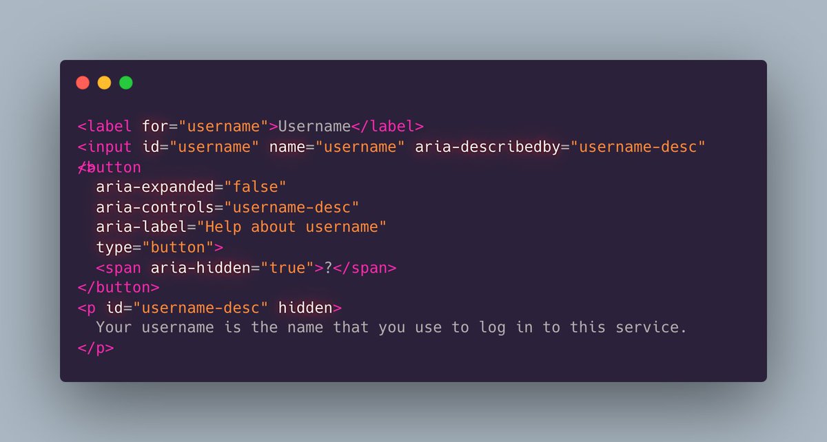
Oops, since my button example uses expand, I should have used aria-expanded too.
Example from MDN:
One more note: aria-label isn’t reliably translated by some browsers, so prefer aria-labelledby over aria-label.
More here: https://adrianroselli.com/2019/11/aria-label-does-not-translate.html#Update06