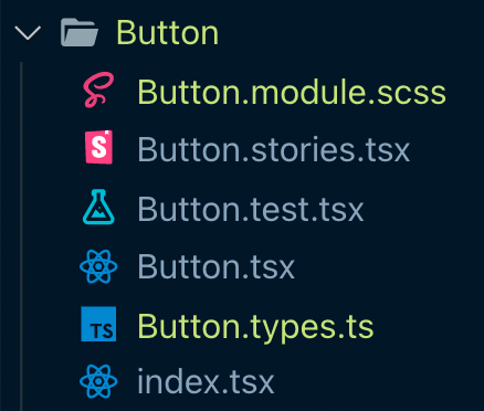
I often implement React components via 6 files: 1
I often implement React components via 6 files:
1. Button.tsx - component
2. Button.types.ts - TS types
3. Button.test.ts - Jest + testing-library unit tests
4. Button.stories.tsx - Storybook stories
5. Button.module.scss - CSS module
6. index.tsx - Re-exports (barrel)
#react
index.tsx implements the "barrel" pattern to shorten imports.
Here's all that's in it:
export * from "./Button";
The barrel means I can import the component like this:
import Button from '../Button'; 👍
instead of like this:
import Button from '../Button/Button'; 👎
More details:
1. I often keep the types in the component file. I move them out when they feel too long so they’re “out of the way”
2. I like @tailwindcss, but my current clients don’t use it.
3. When using @remix_run I don’t need CSS modules since its styles are page scoped 👍
Follow up: Some said "6 files is too complex".
4 are optional. Sometimes I:
1. Put types in the component (when short)
2. Put styles in the component (when possible)
3. Skip index.ts
4. Skip Storybook (when not reusable)
That leaves 2 files:
Button.tsx
Button.test.tsx
Simple.
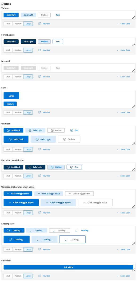
Some people think "How complicated could a reusable custom button be?!"
Answer, quite complicated:
- Multiple variants: Primary, secondary, outline, link
- Multiple sizes: Small, Med, Large, Full screen
- Loading, active, disabled, hover behavior
- Optional icons, etc
Example: